How Leaders Should Use Data to Decide How to Act
One of the toughest jobs for organizational leaders is deciding how to act. You have complex systems to lead and improve—a mix of people, processes, and outcomes. You’re responsible for many results. You need to sift signals from noise without being wrong.
The question hasn’t changed since organizations began: Is our work achieving the results we want? If not, is it a system problem requiring us to change how we work, or are there specific issues we need to address before thinking about improvement?
A quick way to diagnose whether a leadership team is positioned to make good decisions: look at how they look at data.
The Dashboard Problem
Most organizations today have dashboards of measures. Typically, these are tables that mirror financial reporting—listing every measure, its goal, comparisons to previous periods, and the most recent results (Figure 1).
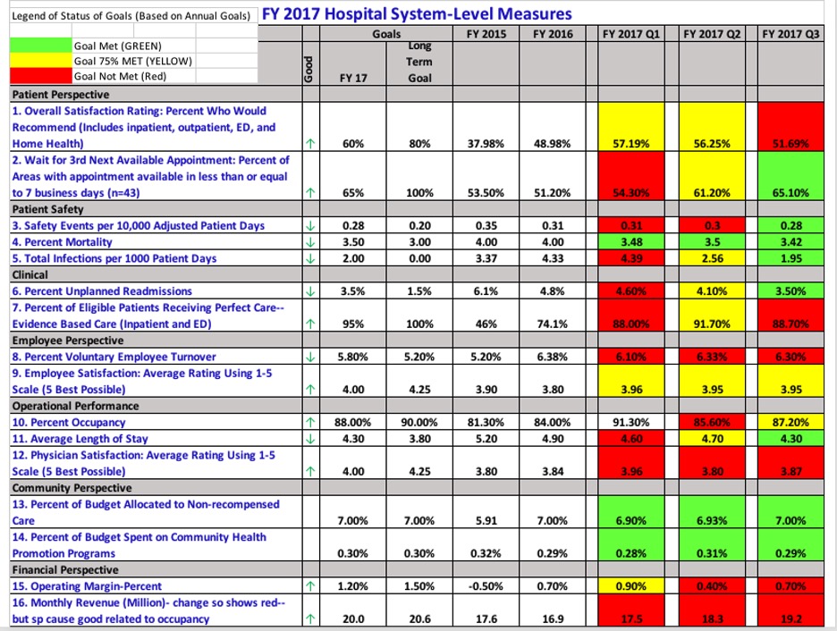
Figure 1. Common display of measures in a health system with data color coded based on goal status.
Traffic light coding is common practice: green means meeting target, yellow means close but off target, red means off target. The intent is to help leaders focus attention. If this were your health system’s performance—mostly red and yellow—you’d likely be concerned. Where would you focus your team’s attention to improve?
I’ve written before about how leaders think traffic light coding guides them versus what actually happens. Let me illustrate with one measure from this dashboard.
The Infection Rate Story
Measure #5 is “Total infections per 1,000 patient days.” The three most recent quarters show improvement: red to yellow to green (Figure 2). Great! Let’s celebrate this work and move on to other red measures, right?

Figure 2. Infection rate per 1,000 patient days by quarter, coded by goal.
Wait. Pull the data for the last 20-30 months (Figure 3). Most months, including many recent ones, aren’t meeting the target. The pattern looks less encouraging when you see the full picture.
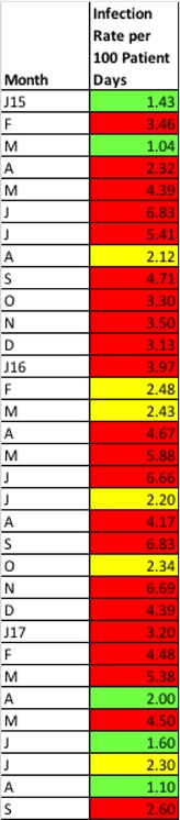
Figure 3. Most recent 20 to 30 months, coded by targets.
Now graph this data over time using a Shewhart chart—specifically, a u-chart appropriate for rate data (Figure 4). Each point is still color-coded based on red, yellow, and green definitions.
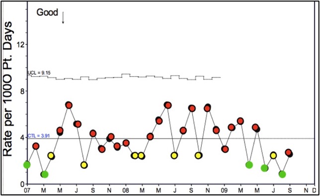
Figure 4. Shewhart chart (u-chart) of infections per 1,000 patient days, coded by targets.
Before we consider whether the mean performance is desirable, ask: Is this chart showing stable performance you would predict into the future, or is it unstable with special causes (outliers or unusual patterns) requiring investigation?
It looks pretty random—common cause variation inherent in the process.
Now look at the color coding. Is there any real difference between the red, yellow, or green dots? Not really. The system is built to produce these results. Unless we change the system of work, we should expect this predictable variation to swing in and out of target by design. While we like this quarter’s green, next quarter could just as likely be yellow or red.
Improvement requires change to the system, not celebration of random variation.
A Better Way to See Your System
When quality is your organizational strategy, leaders select a vector of measures that reflects the organization’s purpose and relates to all stakeholders. It’s a collection of system-wide measures that helps you understand today’s performance and predict future results.
When you display data graphically in Shewhart charts, you can understand variation and act accordingly. Figure 5 shows the same measures from Figure 1 displayed as a vector of measures in Shewhart charts. Notice how much more insight you can gain.
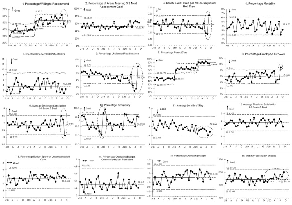
Figure 5. Vector of measures in a health system with data color coded based on goal status.
Figure 6 adds context. Red boxes indicate measures where current performance isn’t meeting desired targets. But several different stories emerge: improvement, concerning special causes, and positive special causes.
Dots indicate charts with special causes warranting investigation. Some are likely due to improvement teams working to change the system. Others are issues you want to understand and address before worrying about improvement. The distinction matters.
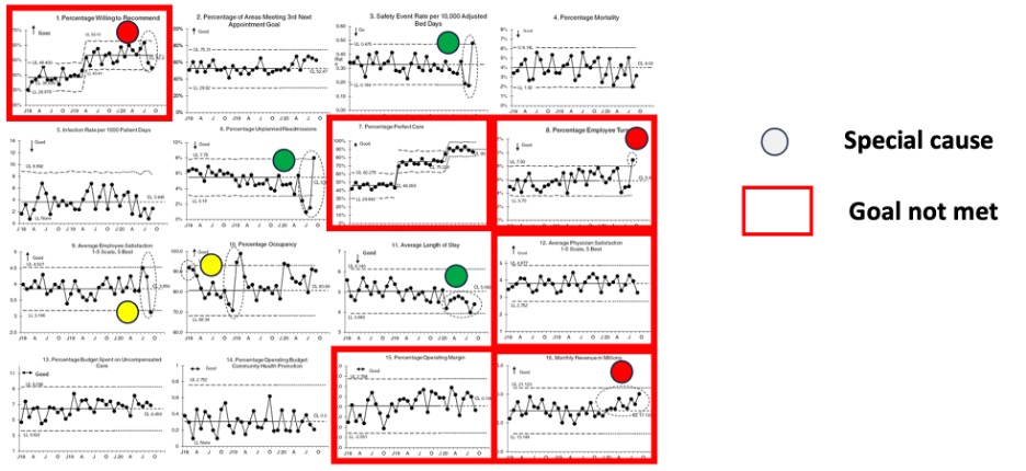
Figure 6. Vector of measures showing goal attainment, special cause, and color coding.
Making Better Decisions
Go back to the typical dashboard in Figure 1. Does it help you understand how your system is performing? Does it guide you to make good decisions about where to investigate, where to intervene, or where to commission an improvement team to change the system? Does it help you see when the system is veering off course or when your changes resulted in improvement?
Viewing your organization as a system is crucial for pursuing quality as your organizational strategy. Developing and using a vector of measures serves as vital signs for your organization. They help you monitor the system you have, intervene when action is required, and see the impact of your efforts to improve the system.
Leaders have dashboards because they know they need data. Quality as an Organizational Strategy builds on this, helping you select the right measures, display them so you can learn and make decisions, and see whether your changes are actually making a difference.
David M. Williams, Ph.D. works with leaders and improvement teams to learn and apply Improvement Science to achieve results and adopt quality as a strategy. He is coauthor of Quality as an Organizational Strategy and The QOS Field Guide.