Drilling Down into Aggregate Data
Every organization tracks a family of measures with data from various moments of time. The list of indicators often blend measures created by leadership with a mix of from other sources like accreditation bodies, regulators, and benchmarking vendors. These data are usually at an aggregate level or minimally stratified by division or facility. Aggregate data may be useful for judging against your goal or comparing it to other organizations but it offers limited guidance on what’s happening within the organization or what is contributing to the variation we see. How can we learn from aggregate data?
Provost and Murray (2001) describe tools and methods to help learn from aggregate data:
- Shewhart Statistical Process Control tools
- The Drill Down Pathway
- Using the Model for Improvement (Langely et al, 2009) to test changes and make improvements in the system.
Alpha Hospital System is an academic health system in a mid-size city. The leadership team has used a commercial benchmarking vendor to compare the system’s performance against other similar systems for about a year. For several quarters, the hospital system’s “observed versus expected” in-patient length of stay has remained below their goal and below the 50th percentile when benchmarked against the other hospital systems. They agree it’s strategically important to improve their performance.
The Chief Quality Officer suggests that they use a tool one of her improvement advisors has been applying to their aggregate data: the Drill Down Pathway. Let’s use the Drill Down Pathway to learn from Alpha Hospital Systems’s aggregate data.
Identify the aggregate measure of interest. The first step is to identify the aggregate measure to learn from. For these leaders, the measure on their dashboard is “observed versus expected” in-patient length of stay. This is a measure they adopted and began to track when they joined the benchmarking service so they could be compared.
Clarify the measure. Measures should have a standard definition. It’s important to clarify the definition and understand what data is collected to create the measure. You should reflect on how the measure is created. For example, is the measure transformed in a way that reduces learning from the variation like a percentage measure that tracks compliance to a goal or, in this instance, a measure that looks at a predicted versus expected measure instead of looking at in-patient length of stay alone. Collecting data with the least amount of transformation provide enhanced opportunity to learn from the variation.
Create a Shewhart Chart of the Aggregated Data. Unfortunately, most hospital dashboards are reported and presented in ways that limit a leader’s ability to learn and understand what’s going on. Collecting the measure of interest overtime for 20-30 weeks or months enables the data to be displayed in a Shewhart Chart over time. For example, in-patient length of stay is a continuous measure that tracks days. Using an Individuals Chart (I-chart) or XbarS Chart would allow us to see these data over time. Once displayed in a Shewhart Chart, the next question is if the data is stable (in control)? If not, action should be taken to act on the special cause.
Drill down into the measure. If the measure is stable, the next step is to stratify the measure by various organizational units. Organizational units may be regions, facilities, departments, clinics. The organizational unit is whatever unit that was used to roll up into the aggregate measure.
- First, disaggregate the data and place all of the units on the same Shewhart Chart (not shown). This helps to see if the systems view is stable. If not, search for an act on the special cause.
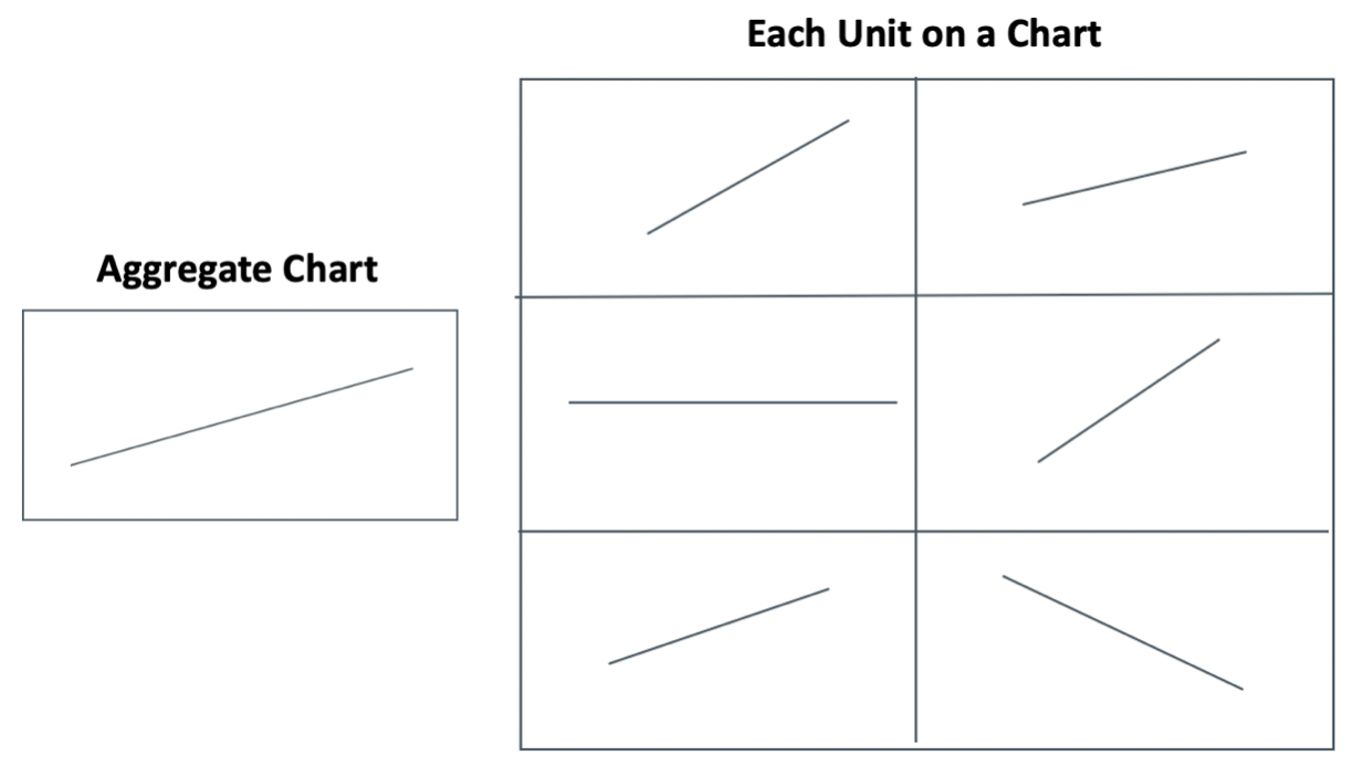
- Second, if the systems view is stable, a separate Shewhart chart can be created for the aggregate measure and for each unit. This is known as small multiples 9see figure). This allows understanding if each unit is stable. If not, search for an act on the special cause.
Figure – Small Multiples of Aggregate and Each Unit on Charts (R.Lloyd).
The next steps in the Drill Down Pathway require some thought, knowledge of the measure of interest, and of the disaggregated units. Using methods like sequencing, stratification, and rational subgrouping data is reorganized to study the causal system and test changes.
This summary is a very high-level overview of the Drill Down Pathway. For a more detailed description with included examples and a flowchart, see Provost and Murray (2011, Ch. 9).
Most organizations have aggregate measures as part of the family of measures. Aggregate measures limit understanding of the variation in the system and identify opportunities for improvement. The Drill Down Pathway supports disaggregating the data and using Shewhart charts to understand the causal system, identify opportunities for improvement, and test those ideas.
—
If this was helpful, share and include me @DaveWilliamsATX. Subscribe to receive a monthly curated email from me that includes my blog posts and Improvement Science resources I think you’d appreciate.
References
Langley et al. The Improvement Guide (2nd Ed.). San Francisco: Jossey-Bass; 2009
Provost, L.P. & Murray, S.K. (2011). The health care data guide: Learning from data for improvement. San Francisco: Jossey-Bass.
The figure of Small Multiples of Aggregate and Each Unit on a Charts adapted from presentations from Robert C. Lloyd, Ph.D.
